Josh Lee James
Digital Product Strategist | Human Experience Evangelist
What should the next generation of Dell’s digital design system look like? How can we apply principles from the physical world to our digital space, and in the process prepare ourselves for the next data decade as we all move into the metaverse?

Concept Light was a quick exploration into answering those questions.
Concept light was a vision for the future of Dell’s digital design language, built off of the New Digital Palette that we had defined and showed how we imagined pushing the boundaries of flat, monolothic webpages. It also began to explore how borrowing elements of the physical world and translating them into digital space might not only give us a great visually rich on-screen design system, but get us ready for future-generation metaverse spaces.
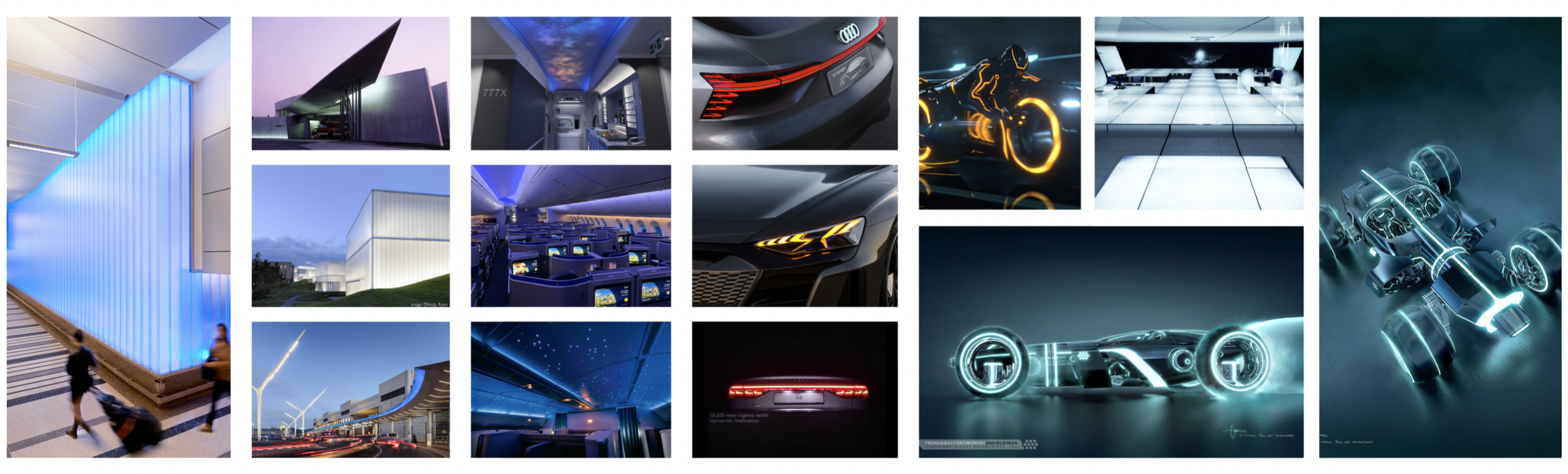
The visual language concept came from our love of technology and our humble imagination of what we hope the future looks like.
In coming up the conceptual visual style, we were heavily inspired by films like Tron and Blade Runner; and architecture from the masters like Zaha Hadid and Bjorke Ingels and industrial design like that of Audi’s lighting design team.
What we loved about these works of art was how they used light to turn ordinary basic forms into something spectacular—and how they used light to accentuate the details they wanted to place attention upon. The way Zaha Hadid lights up the curvature of her buildings. The way Audi’s lighting signatures are in many ways even more recognizable than it’s brand mark.
How do you design something that’s timeless but always of the future?
All of our visual inspiration also heavily evoked the future and in a way that somehow remains current no matter how much time has passed. At the time we did this exercise, Tron was already 10 years old. As were many of Zaha’s buildings. And Audi’s cars that we looked at. This was hugely important to us because we wanted the look and feel and thus the design system it influenced to have a lifespan of anywhere between five and ten years.
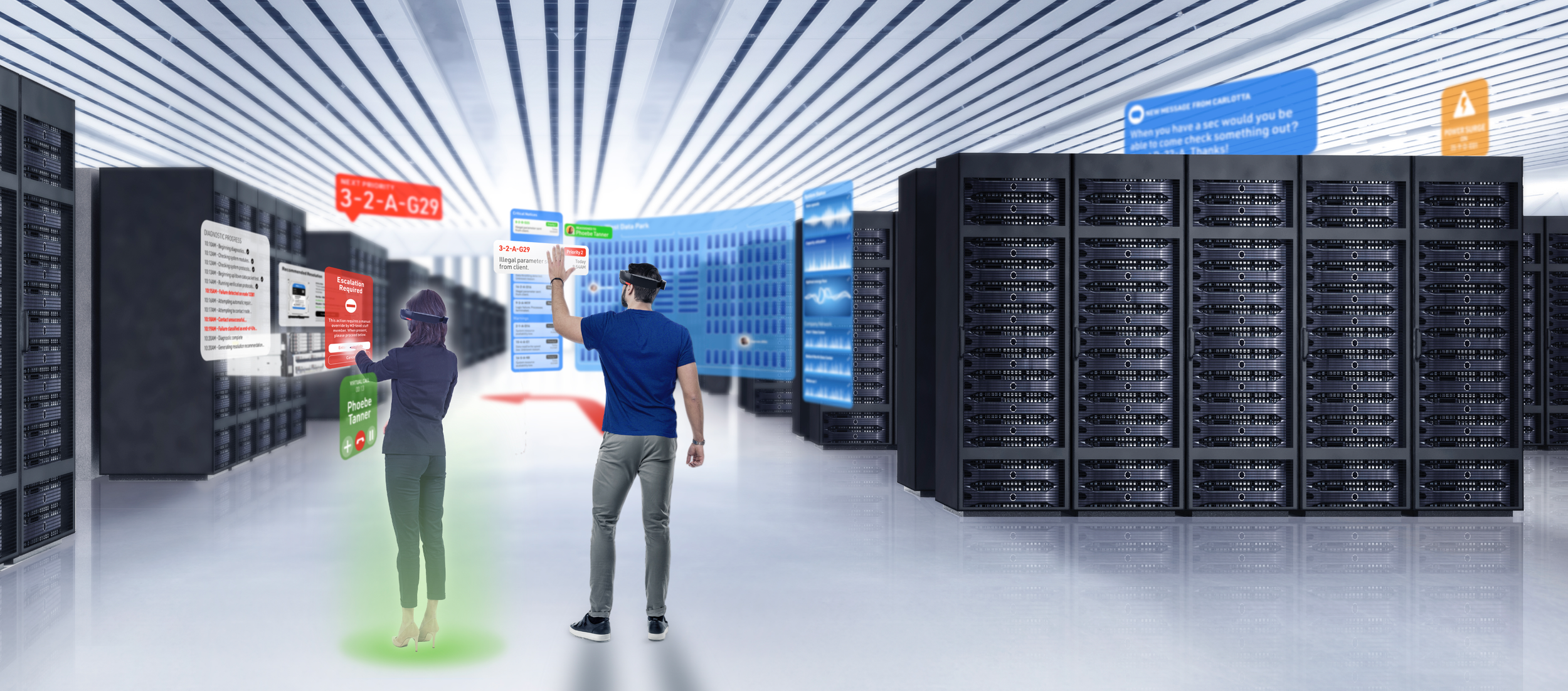
This is a rendering of an AR-based digital platform that we came up with as part of Project Eco (see that here).
Ready for a potentially platform-less future?
And five to ten years from now, we know that emerging technologies and ideas like the meta-verse will probably be much closer to maturity and public adoption. So the design system that we created needed to be able to transcend medium from the digital experiences of today (on-device applications and browser-based websites) thru to VR, AR, and meta tomorrow.

So why the idea of light?
Well, it wasn’t just that we loved the almost liquid visuals of light from our reference material above. It was that we loved the idea of being able to use light in a digital space the same way that light is used in physical space. What does that mean?
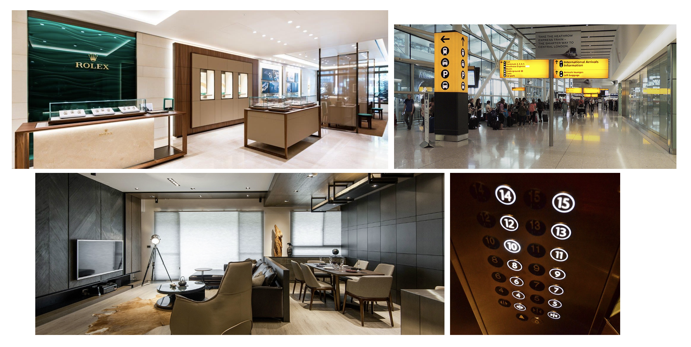
Because the reason for lighting something is a universally understood construct.
Why do we put lights where we do in our home? They’re generally focal points or places we attend to. Why do boutiques put spotlights on products? Because they want to call attention to them. Why do our car dashboards light up? Because each button (or simulated button these days) is a function that we can activate by pressing it. Why do things flash and light up when something goes wrong? Because we can then visually recognize them. Why does Heathrow use bright yellow signs? Because they can be immediacy picked out of a chaotic situation.

In short, humans look for lit objects and spaces by nature.
in order to immediately (or quickly) understand what to look at, where to go, and prioritize their actions. That’s essentially what a design system, used correctly, should allow one to do too.

But light (and light in space) do more than just grab attention.
Space isn’t just defined by light, it’s also defined by dimensionality. And light, space, and dimension together create tactility. When something is dimensional, we assume it can be touched, moved, and interacted with. Buttons in an elevator, for example (and when activated they light up). So that’s perfect for things like CTAs and cards that we want to be touched.
And when one touches, turns, slides, or otherwise manipulates our UI, it should respond in a physically correct manner. A toggle moves along a track that’s usually recessed. So does the needle on a meter or gauge. And what about when a button is literally pressed?


Light and space also made it really easy for us to think about light mode and dark modes.
And this is obviously a requisite for any contemporary design system. But the thing was, the earth has been doing light and dark mode since the beginning of time. So there really wasn’t even anything new for us to do here. We simply applied the way that the sun lights the world during the day versus the way our technology and devices create artificial light at night and translated those differences into digital form.
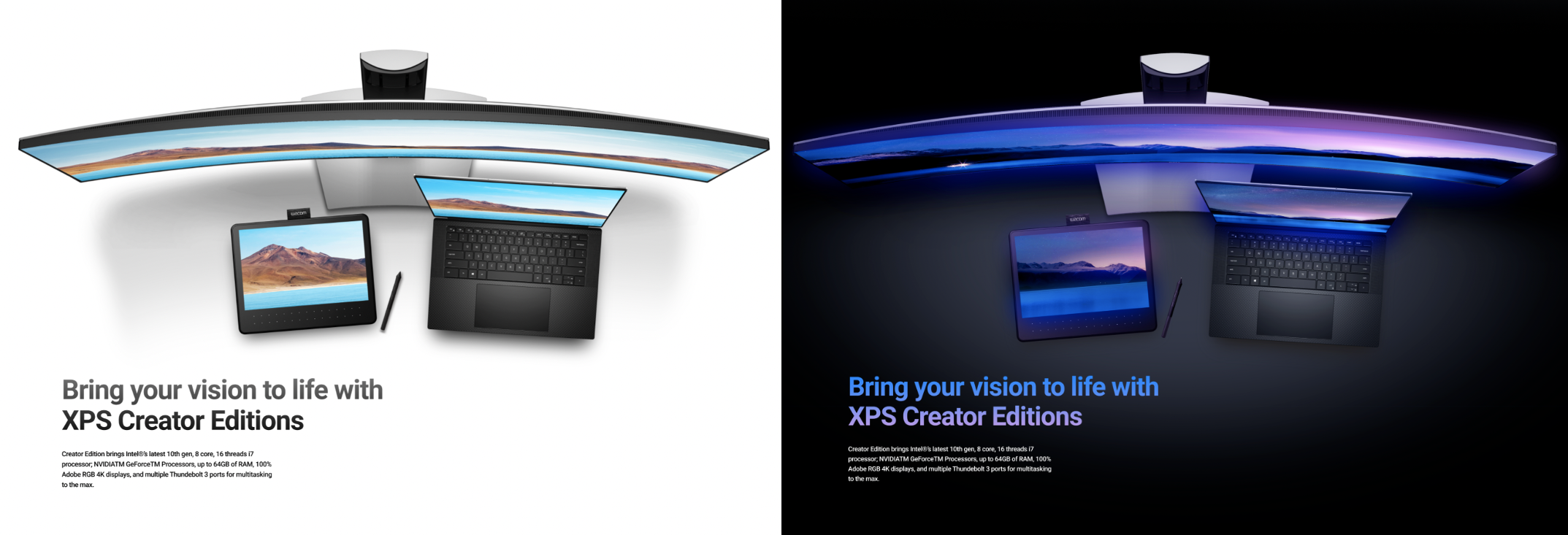
In light mode, it’s all about EXTERNAL light, wherein forms create shadows. While in dark mode, it’s all about INTERNAL light and how internally lit objects glow and diffuse light from within and or around themselves.
See more of Concept Light in components and application explorations
In the galleries below, you’ll see all the explorations on look and feel, application, and design language that the Concept Car team (see my current role) had finalized the look and gotten approvals and alignment, the conceptual visuals that you’ve seen here and our strategy for how to use light within the design system was handed off to the Dell Design System team to begin to implement in their product.
I’d also definitely recommend taking a look at the visuals within the Unified Customer Experience Vision and Strategy work shortly after this, we couldn’t help but start to expand it within the concept UI within that work too.
Web component exploration
Click on each thumbnail to open the page in a new window and scroll through


Application and Page Layout Look & Feel Explorations
Click on each thumbnail to open the page in a new window and scroll through


